Eikon Therapeutics
Eikon Therapeutics is a biopharmaceutical company that discovers and develops drugs using revolutionary single molecule, live cell imaging technology. They reached out to me to design a logo for them.
I started this project by asking them many questions around the company’s identity, keywords that best represent their company, visuals that we should avoid, what they really see when looking through the microscope, etc.
After I had better understanding of their company, I started thinking about directions we can approach. And then I came up with this round 1 of concept and logo designs.
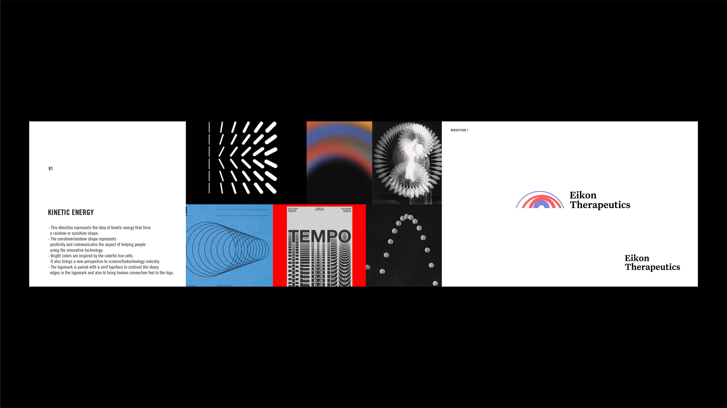
Direction 1
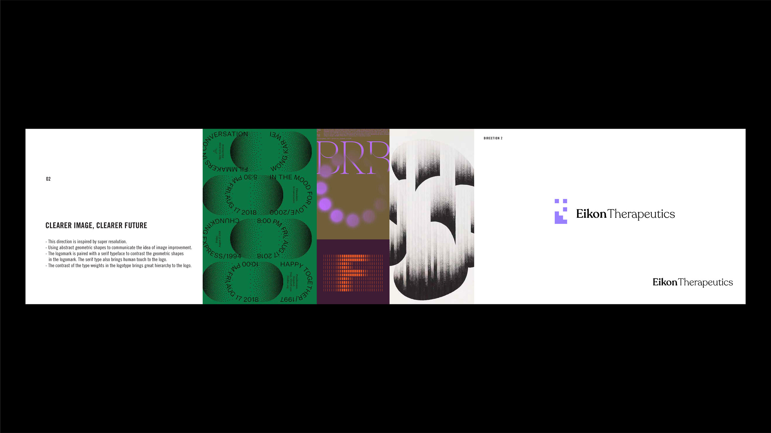
Direction 2
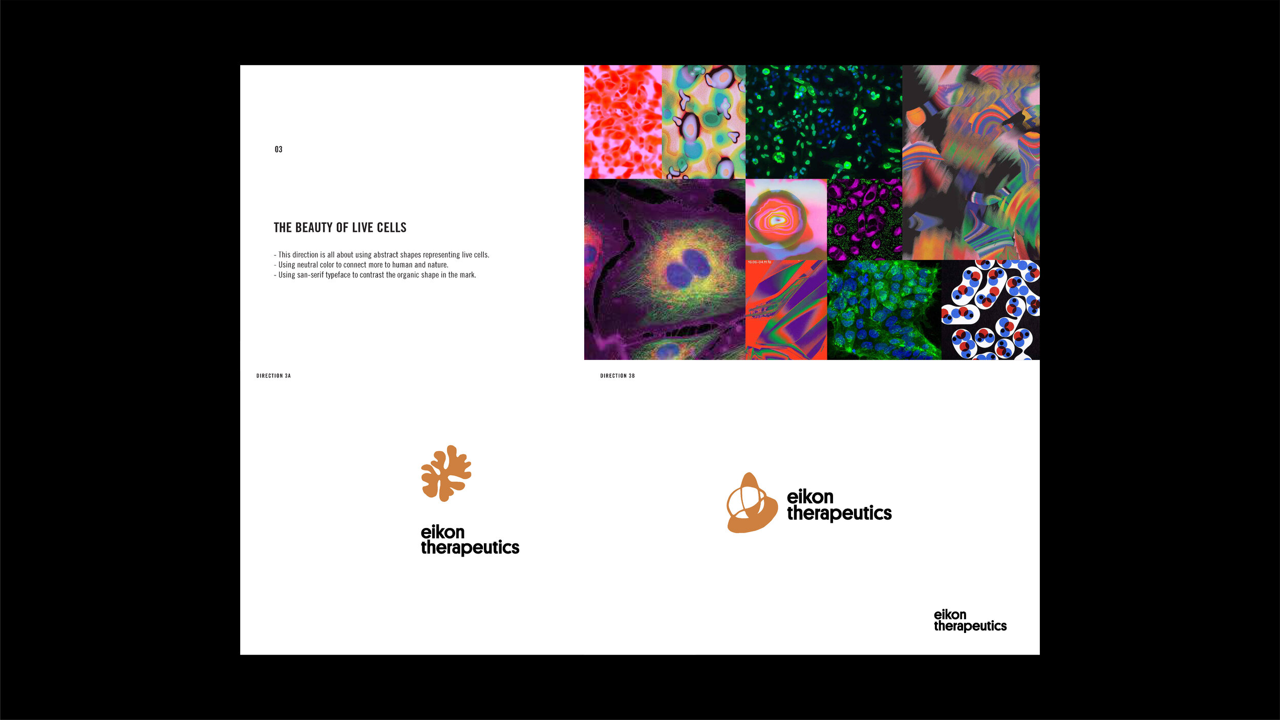
Direction 3
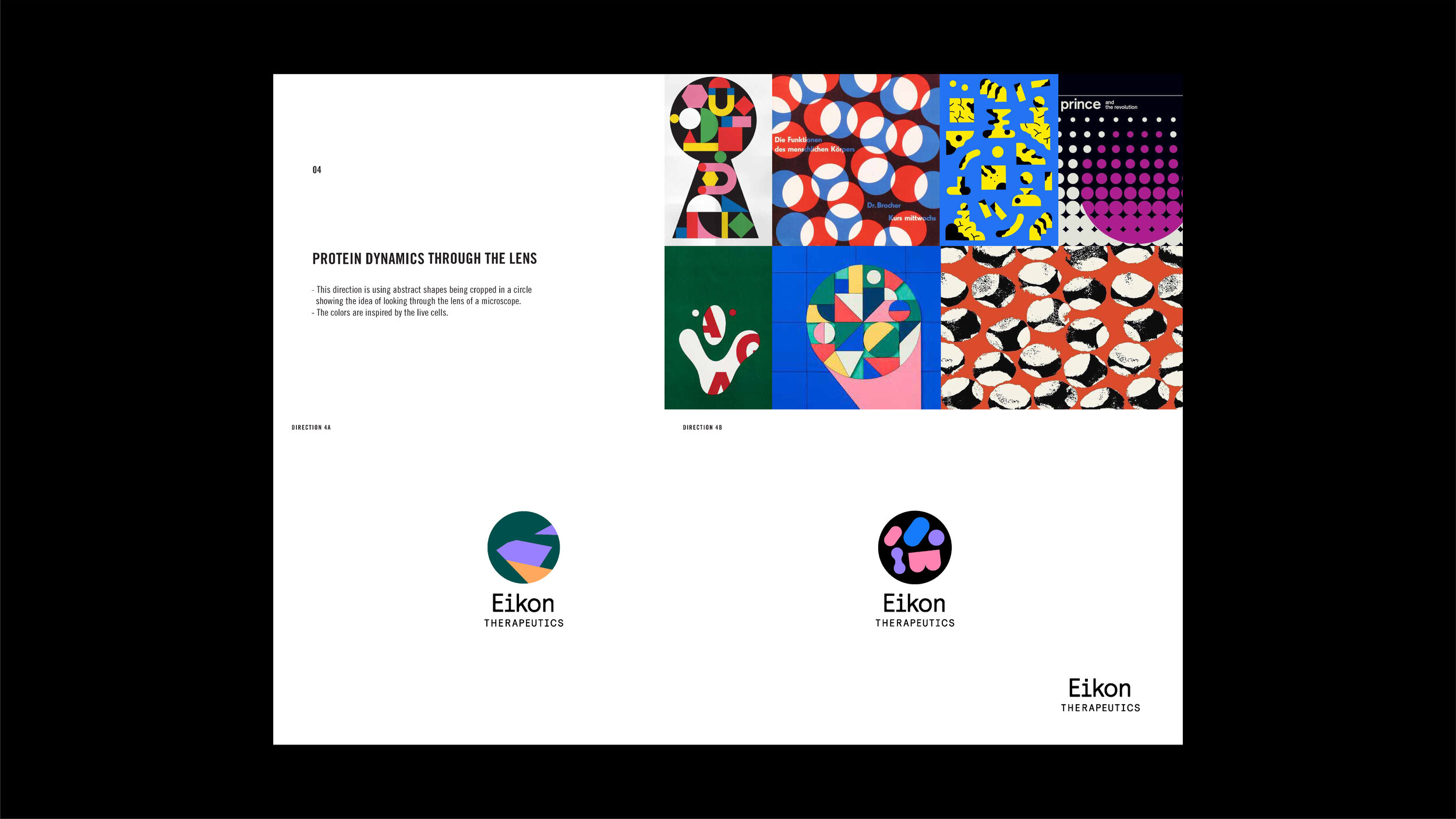
Direction 4
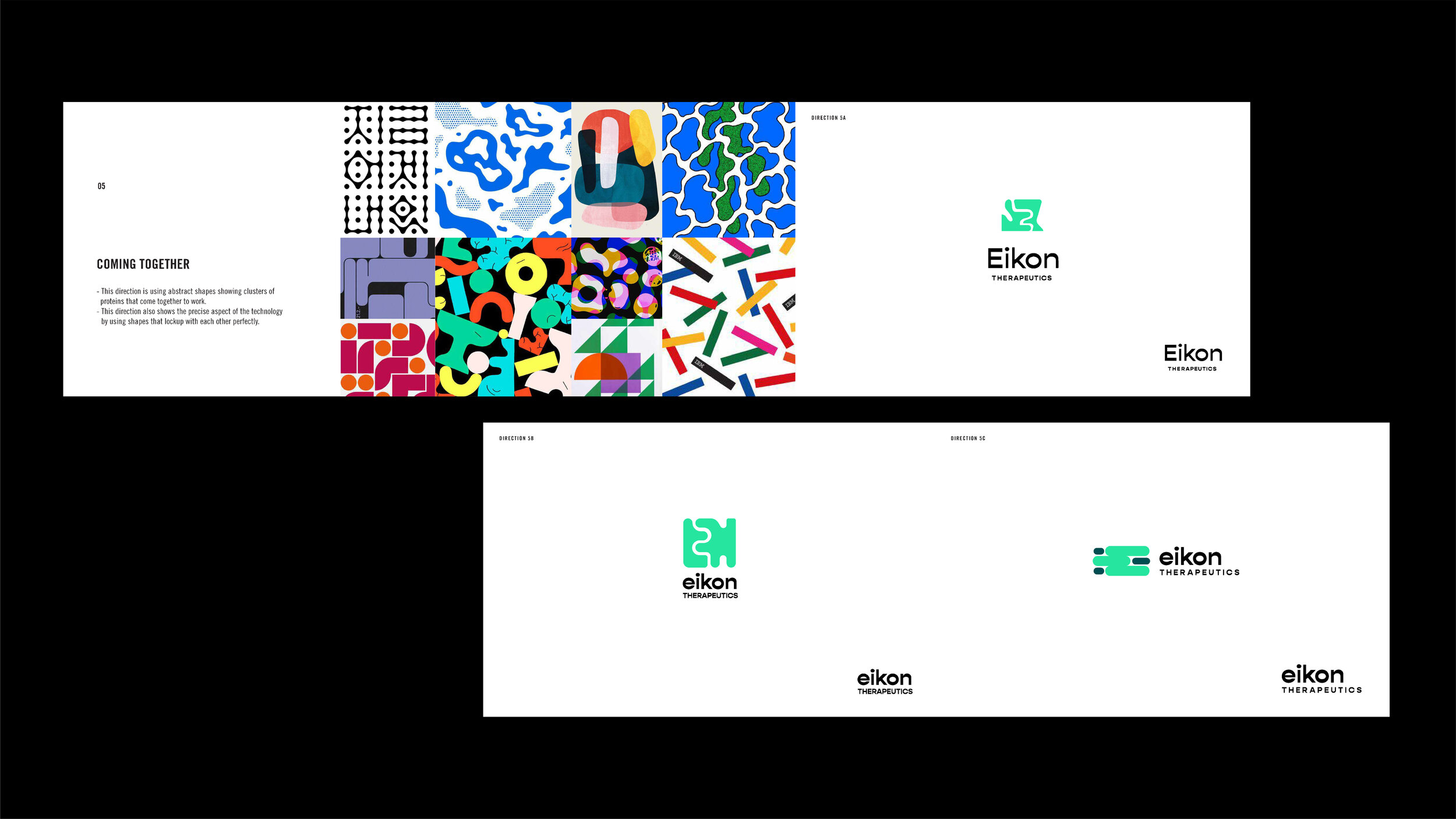
Direction 5
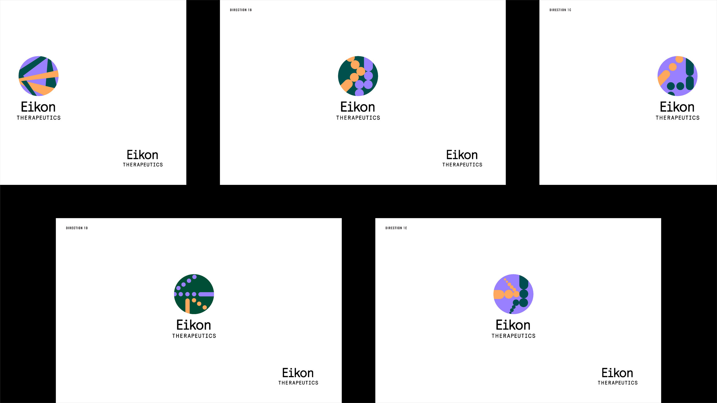
After presenting those concepts. We narrowed down to 2 directions to explore further. This image above is the exploration on a direction we moved forward with.
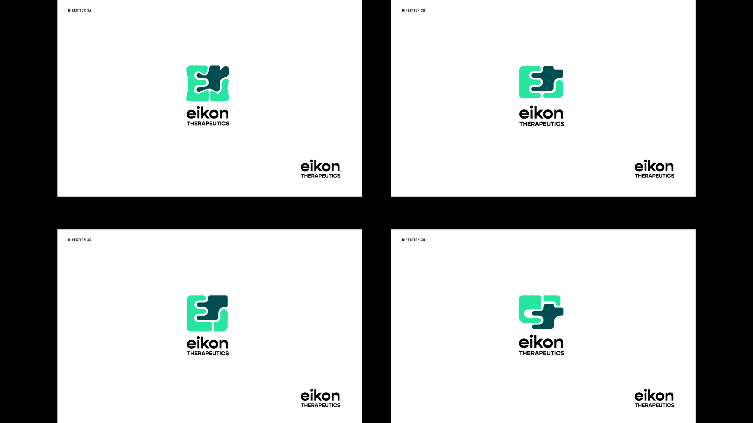
This is the exploration of another direction we move forward with from round 1.
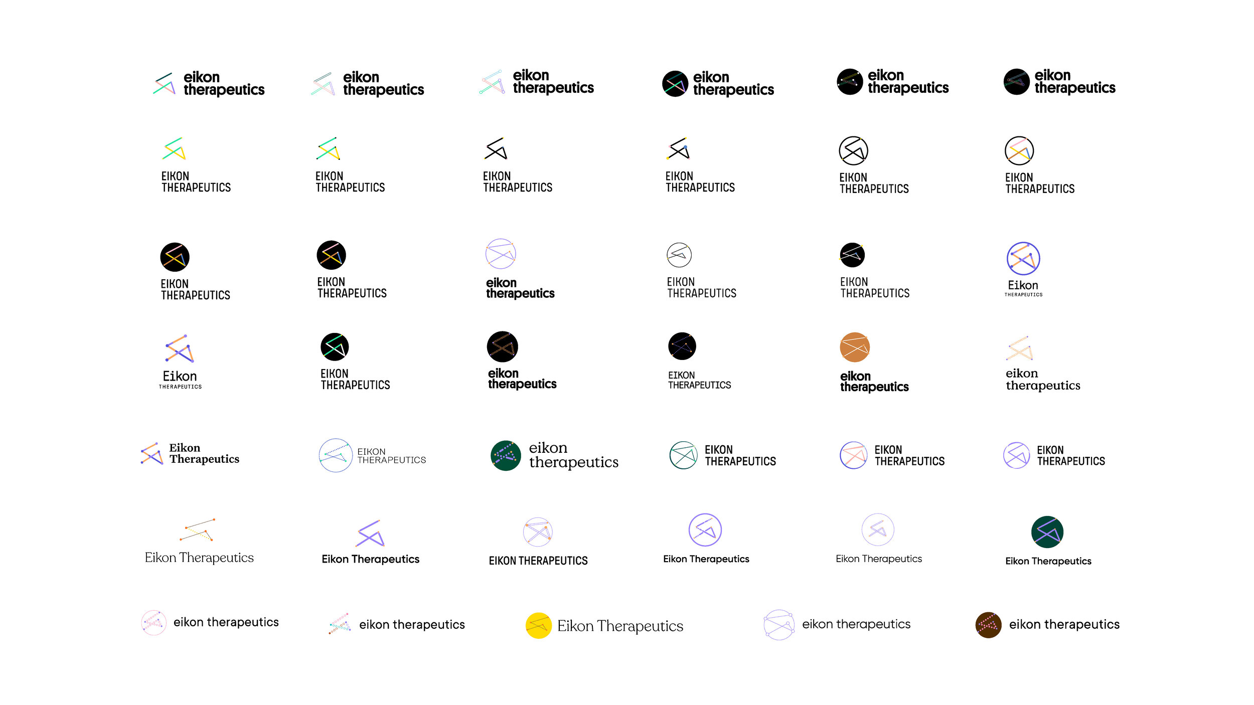
We ended up moving forward with the protein dynamics through the lens direction. This image above is the exploration of that direction. In this exploration I was trying to find what works best as far as typography, composition, and colors.
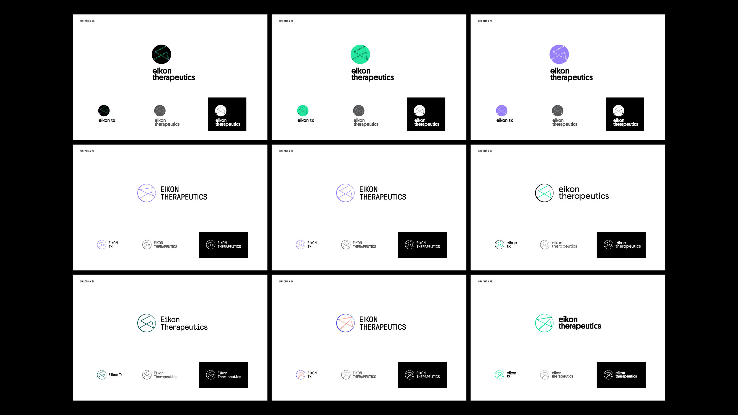
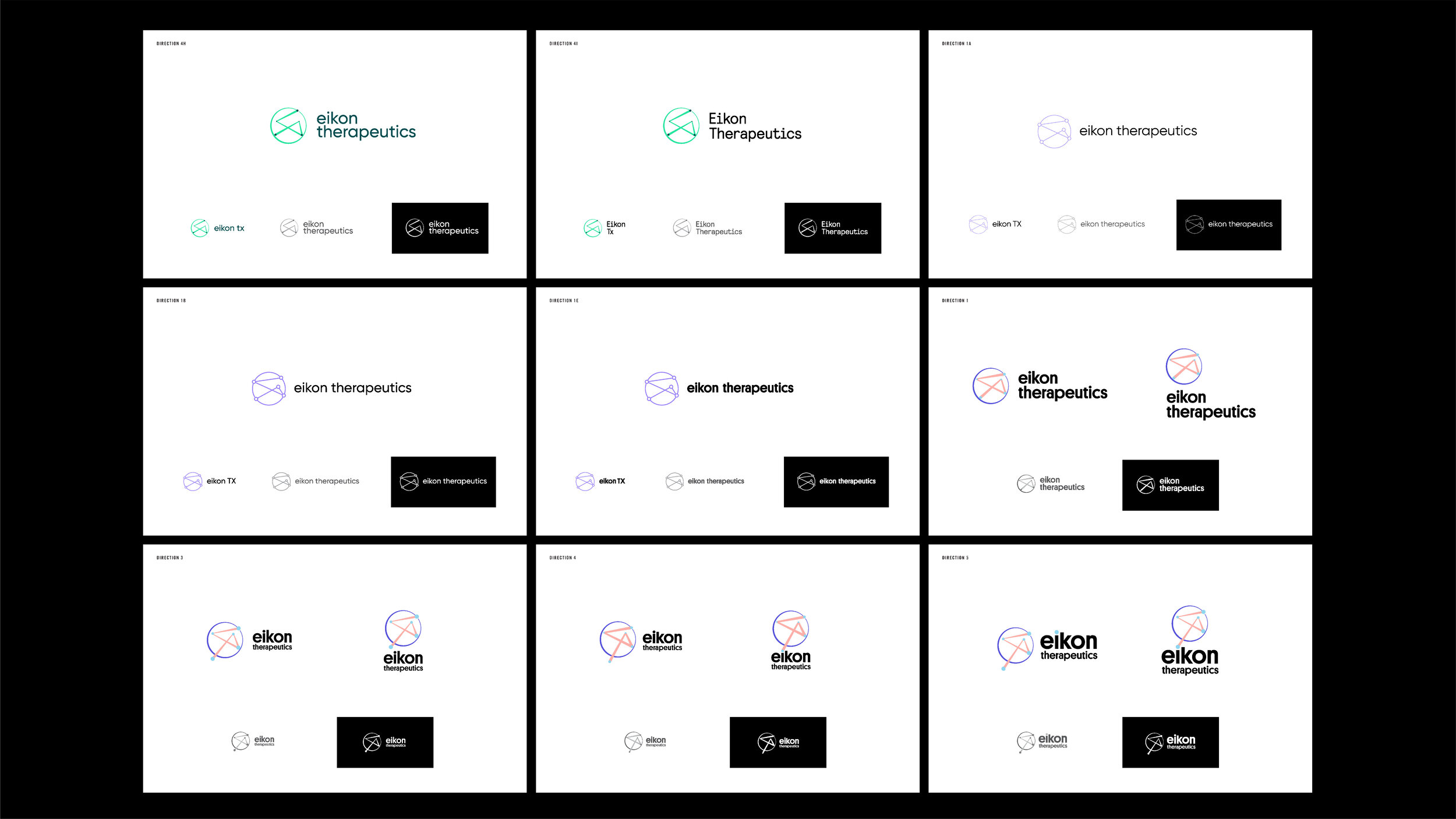
After we agreed that the mark should show depth and feel dynamic. We moved forward with the one that represent that best. These are the exploration based on what we moved forward with. I was still trying to find the best balance of color, shape and typography. In this stage I started to look into the details more and started to think about how are these logos look in color, black, and white.
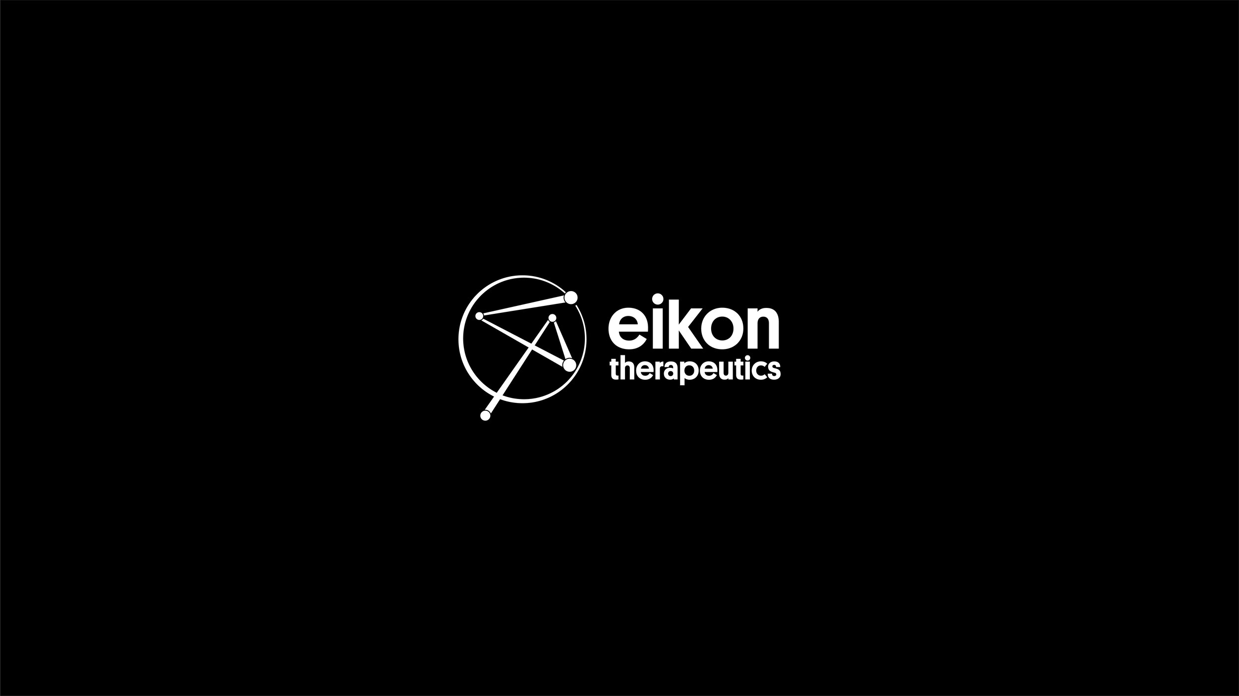
Final horizontal logo
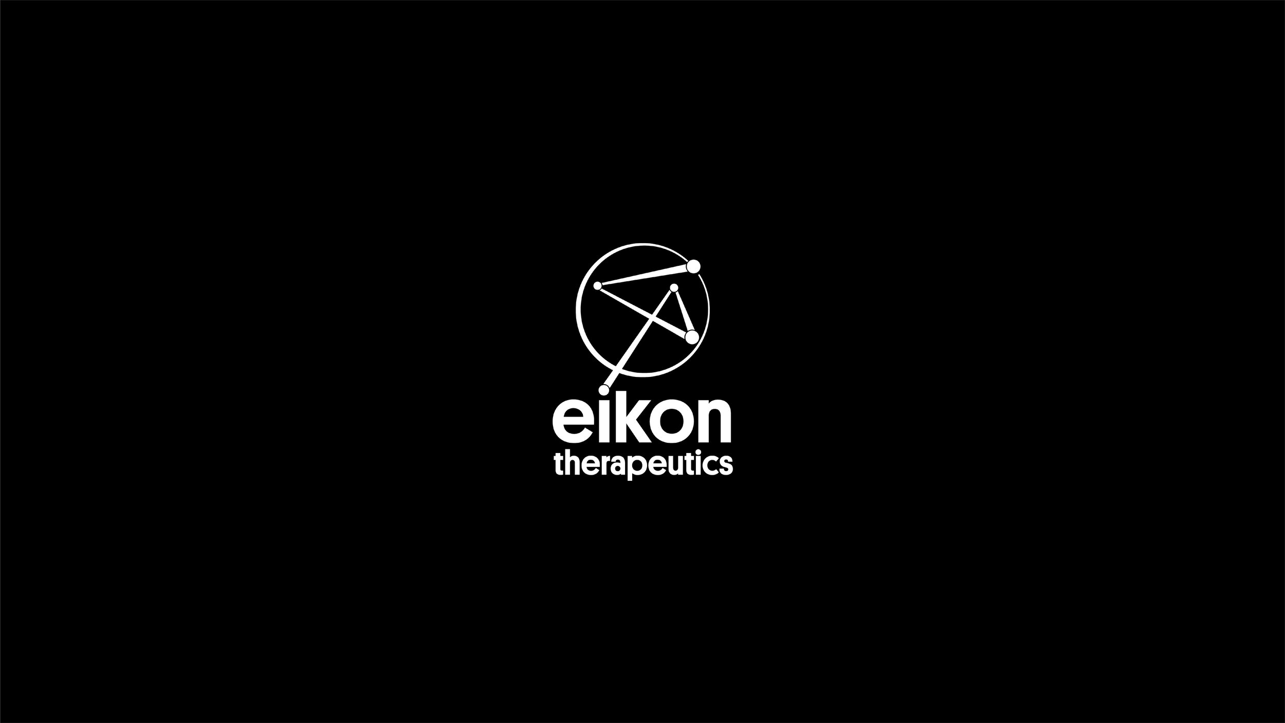
Final vertical logo
